How Images Affect Website Speed: Complete Performance Optimization Guide
Learn how images impact your website loading time and discover proven techniques to optimize images for lightning-fast performance without sacrificing quality.
Images account for approximately 50% of the average webpage's total size, making them the single most impactful factor in website performance. Understanding how images affect loading speed and implementing proper optimization techniques can dramatically improve user experience, search rankings, and conversion rates.
The True Cost of Unoptimized Images
Every second of delay in page load time costs businesses real money. Research shows that a 1-second delay in page response can result in a 7% reduction in conversions. For an e-commerce site making $100,000 per day, that translates to $2.5 million in lost sales annually. Images are often the primary culprit behind slow-loading pages.
Mobile users are particularly affected. With limited bandwidth and varying connection speeds, oversized images create painful waiting experiences. Studies indicate that 53% of mobile users abandon sites that take longer than 3 seconds to load. Optimizing images is often the fastest path to achieving acceptable load times.
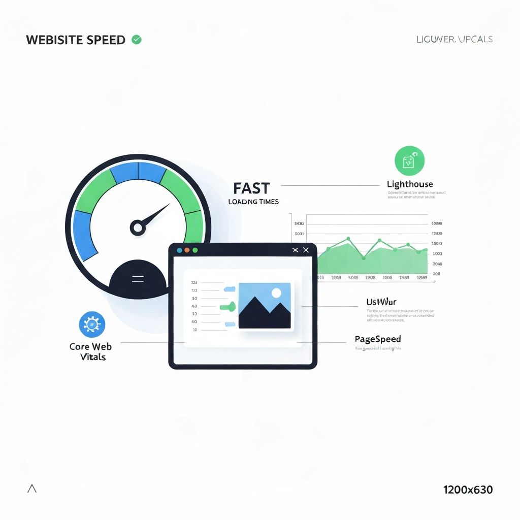
Understanding Core Web Vitals and Images
Google's Core Web Vitals directly measure user experience and influence search rankings. Images impact all three main metrics: Largest Contentful Paint (LCP), First Input Delay (FID), and Cumulative Layout Shift (CLS).
Largest Contentful Paint (LCP) measures how quickly the largest visible element loads—often a hero image. Google considers LCP under 2.5 seconds as "good." Unoptimized hero images frequently push LCP above acceptable thresholds, hurting both user experience and SEO.
Cumulative Layout Shift (CLS) measures visual stability. Images without specified dimensions cause layout shifts as they load, creating frustrating experiences where content jumps around. Always include width and height attributes on image elements to reserve space before images load.
Image Format Selection for Performance
Choosing the right format dramatically affects file size. WebP typically offers 25-35% smaller files than JPEG with equivalent quality. AVIF, a newer format, can achieve 50% smaller sizes but has limited browser support. JPEG remains the universal fallback for photographs.
Use PNG only when transparency is required—PNG files are significantly larger than JPEG for photographic content. For simple graphics with few colors, consider SVG for infinite scalability at minimal file size. GIF should only be used for simple animations; video formats are more efficient for complex motion.
Responsive Images: Serving the Right Size
One of the biggest performance mistakes is serving desktop-sized images to mobile devices. A 2000-pixel-wide image displayed at 400 pixels wastes 80% of the downloaded data. Responsive images solve this by serving appropriately sized images based on device characteristics.
The srcset attribute allows browsers to choose from multiple image sizes. Combined with the sizes attribute, which tells browsers how large the image will display, this enables intelligent image selection that saves bandwidth and improves load times across all devices.
Lazy Loading: Loading Images On Demand
Lazy loading defers loading images until they're needed—typically when they enter or approach the viewport. This dramatically reduces initial page load time by loading only immediately visible images. The native loading="lazy" attribute makes implementation trivial.
However, avoid lazy loading above-the-fold images, especially your LCP image. These should load immediately with high priority. The fetchpriority="high" attribute can signal to browsers which images are critical for initial render.
Compression: Finding the Quality Balance
Compression reduces file size by removing data. Lossy compression (JPEG, WebP) removes some quality for significant size reduction. The key is finding the threshold where size savings are meaningful without noticeable quality loss.
For most web images, 75-85% JPEG quality provides excellent visual results with substantial file size reduction. Test compression levels on representative images to find your optimal balance. Tools like ImageToolsPro make experimenting with different quality levels easy with instant preview and file size comparison.
Content Delivery Networks (CDNs) for Images
CDNs serve images from servers geographically close to users, reducing latency and improving load times. Many CDNs also provide automatic optimization, format conversion, and responsive image generation, simplifying your workflow.
Image-specific CDNs like Cloudinary, imgix, and Vercel's image optimization can transform images on-the-fly, serving WebP to supporting browsers and JPEG to others automatically. This removes the need to generate and manage multiple versions of each image.
Measuring and Monitoring Image Performance
Use tools like Google PageSpeed Insights, Lighthouse, and WebPageTest to identify image-related performance issues. These tools highlight oversized images, suggest modern formats, and estimate potential savings from optimization.
Regular monitoring catches regression. Set up automated performance testing in your deployment pipeline to ensure new images meet your optimization standards before reaching users.
Practical Optimization Checklist
Follow this checklist for every image: Resize to the maximum display dimensions needed. Convert to WebP with JPEG fallback. Compress to 75-85% quality. Include width and height attributes. Implement lazy loading for below-fold images. Use srcset for responsive images. Serve through a CDN when possible.
ImageToolsPro simplifies most of these steps through an intuitive interface. Upload your images, resize to needed dimensions, convert to optimal formats, and compress—all in your browser with instant preview of results.